A worrying political context
 At a time where the Black Lives Matter movement has gone global and with an overall denunciation of police violence in many countries we have decided to take a closer look at the police arrests in the USA. What we want to know is: is there a racist bias in police stops in the US ? If so, what link could it have with the political inclination of the region studied ?
Stanford’s open policing study has shown how police behaviour can suggest presence of prejudice towards different ethnic origins. Needless to say that, if significant, correlations between political inclination and racial disparities in police stops would cause even more questioning on the values represented by certain political parties.
Let’s quantify racial bias
What data are we looking at ?
For this study we use a dataset of 100 million traffic stops across the United States aggregated over varying time periods between 2000s and 2018. We compare this data with the results of the 2016 US presidential elections taken from The New York Times website.
Is racial bias measurable ?
This is difficult to quantify because many parameters are subjective. This is why we are interested in car stops and the potential searches to which they lead. This makes it possible to study uniform and more concrete characteristics: location, reason for the arrest, decision to search, “success” of the search, and skin colour of the driver. We focus on two parameters:
- the hit rate, the “success” rate of searches for drug possession during police arrests. If it is lower, it may show a bias on the part of the police officer.
- the threshold: the level of evidence necessary for the police officer to decide to search someone. A lower threshold may indicate that the police officer initiated a search with less evidence, which may be biased by the colour of the driver’s skin.
Quick note for better understanding: As stated in the paper, the hit rate is “the proportion of searches that successfully turn up contraband”. The inferred threshold is calculated thanks to the threshold test and is also found in the dataset of the paper. It “incorporates both the rate at which searches occur, as well as the success rate of those searches” and reflects the level of the “evidentiary bar applied when making search decisions”. Therefore, a lower inferred threshold shows an inclination of searching a driver without evidence against him or her, as well as a lower hit rate.
Comparing red and blue states
Which states and why ?
Selecting which states to represent requires multiple steps. First of all, not all states have all of the required information for our study, that is the calculations of hit rate and threshold test. This first narrows us down to the states of: Connecticut, Illinois, North Carolina, Rhode Island, South Carolina, Texas, Washington, and Wisconsin. Now, let’s select states that seem to be most significant: that is, the ones that had the highest percentage of votes for the party that won. This takes out North Carolina, which had a percentage very close to 50%. Finally, we took out Wisconsin, since it tends to be a swing state.
This divides our 6 remaining states into two groups: South Carolina and Texas in the red group, and Illinois, Connecticut, Rhode Island and Washington in the blue group.
Data visualization
Before plotting our rates, we first want to check if our dataset is big enough: are there enough police stops and searches for our results to be significant? The results are in the following table:
| State group | Number of stops per year | Number of searches per year |
| Red | 2 104 964.4 | 47 958.6 |
| Blue | 1 071 249.6 | 29 642.0 |
Okay, we’re talking millions of samples. Looks big enough! Let’s proceed with our plots for hit rates and threshold tests.
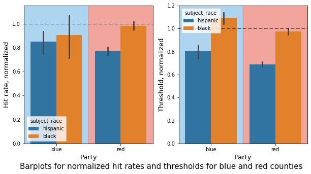
Hit rates and threshold in blue states compared to red states
Let’s have a first look at our data through the following visualization:
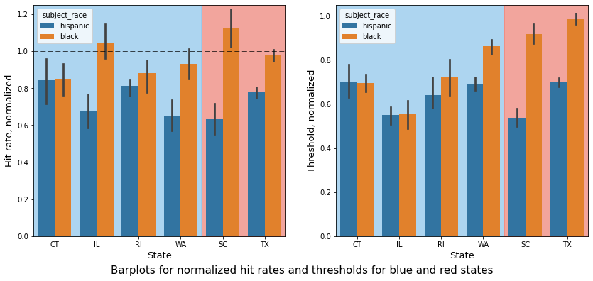
Here we normalized black and hispanic hit rates in each state with the respective white hit rate. This allows us to only have values between zero and one and visualize the differences between them in a clearer way. This is also necessary because hit rates and thresholds could be low or high for all ethnicities in a state, what matters is the difference relative to the white hit rates and thresholds.
- Can you see how all thresholds (right plot) for minorities are lower than the ones for white drivers ?
- It’s almost the same for the hit rates (left plot) ! Can you spot the two states that make an exception ? (it’s Illinois and South Carolina)
- All parameters for hispanic drivers are lower than for black drivers, with a few exceptions (hit rate in Connecticut, threshold in Connecticut and Illinois)
But … Can we really see a difference between red and blue states here ?
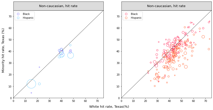
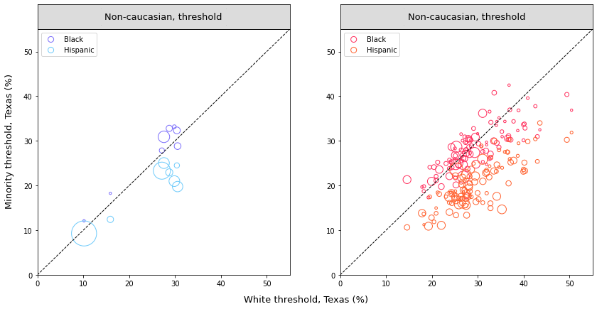
In order to answer this question, let’s look at the distribution of the findings. We plot a parameter for a minority (ex. the hit rate for black drivers) against the same one for white drivers. The ratio minority/white should be 1 if there is no disparity, shown by a point on the plot on the diagonal y=x. See the results here:
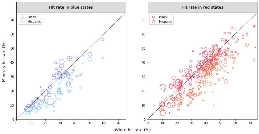
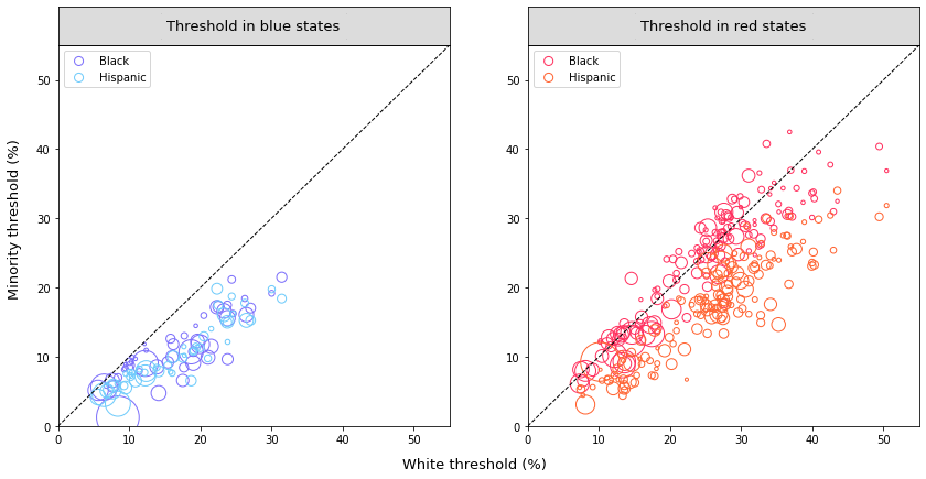
Can you see how the majority of the points are below the diagonal, with a particulary long distance in the threshold plot in blue states (left plot, below)?
More generally, we can observe that:
- there are clearly more points below the diagonal than directly on and above it
- for the hit rates, it doesn’t matter if you’re in a blue or red state: hispanic drivers are placed further below the diagonal than black drivers. This means that searches on hispanic drivers have lower relative hit rates than the ones on black drivers.
- for the thresholds: in red states, we observe the same pattern, with lower thresholds for hispanic drivers than for black drivers. In blue states however, we observe the same disparity for both races.
But let’s be careful: there is a large amount of points in red states and far less in blue states, which can create bias in our visualization. Note that the size of the points correspond to the number of police searches per year for the two races plottted in the county considered.
As a conclusion : Non-Caucasian drivers have lower values for hit rates and threshold than white drivers, in both colors of state. Moreover, this gap widens for hispanic drivers !
Statistics
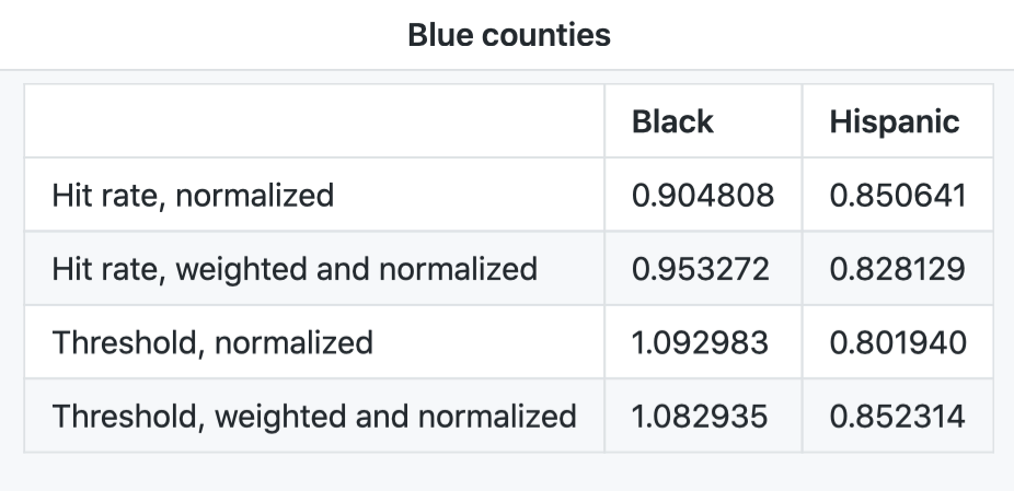
Table with normalized and weighted mean:
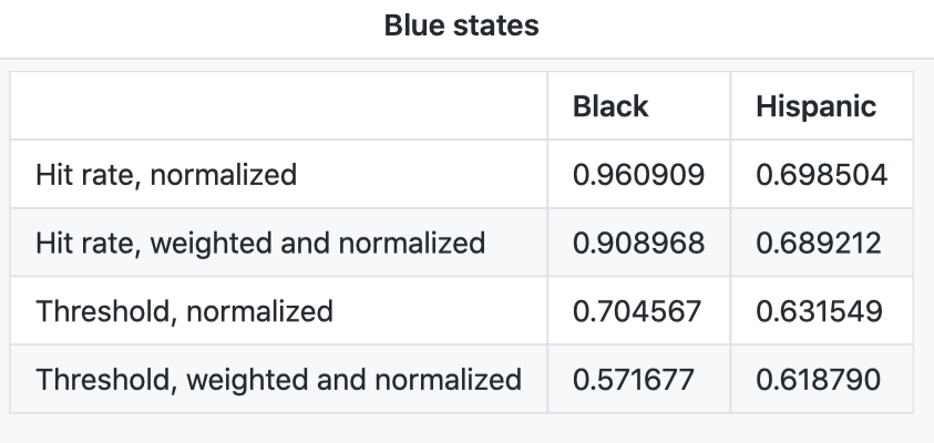
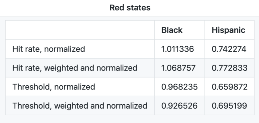
Here we have two tables. They contain normalization of party average race specific hit rates and inferred thresholds with respect to white values, and weighted average of normalized data. Let’s compare red vs blue: normalized means are lower in blue states than in red states. Also, while weighted means tend to be lower than their unweighted equivalent in blue states, the opposite trend is seen with weighted averages in red states. What does this mean? Well, we have differences between the normalized means that are even bigger between red and blue states when weighing our data.
Regardless, statistical tests are necessary in order to quantify the significance of these differences.
Mann-Whitney U test
Okay, but which test is appropriate? After trying out different tests on the distribution of the variables, we prefered to use the Mann-Whitney U test to compare the means because we assume that the distributions are not normal. Our null hypothesis: means from blue and red states are the same. The null hypothesis will be rejected in the case that the p value is less than 0.05. Rejection of the null hypothesis will support the claim that the means are significantly better.
The results are as follows:
| p-value | |
| Non-normalized | 2.2283e-06 |
| Normalized | 0.14982 |
We can see that normalizing is important: without normalization the means are clearly not the same! The non-normalized hit rates test supports the claim that the means are significantly different. Meanwhile, the test for normalized hit rates does not enable us to reject the hypothesis that the means are the same. Therefore, from now on, we will only compare normalized values.
Okay, let’s run some more tests! This time on the mean hit rates and thresholds for black and hispanic people:
| p-value | |
| Mean Black hit rate | 3.5143e-16 |
| Mean Hispanic hit rate | 0.08968 |
| Mean Black threshold | 0.19645 |
| Mean Hispanic threshold | 0.14982 |
Given these p values we can only reject the null hypothesis for mean black thresholds, suggesting bias in black thresholds for blue states. The rest of p values are small but not low enough to reject the null hypotheses.
Prediction model
We also trained models on the data that predict the normalised, weighted average for both hit rate and threshold. Our goal was to check whether a significant coefficient was associated to certain parameters such as the party of the state. No such coefficient was found, and large p-values did not allow us to conclude anything.
Our first observations
Well… Apparently there is a significant difference according to our statistical tests. But it’s not obvious! How can we sharpen our study? The election results we used are state-wide. As they cover a very large population and a very large number of counties, they average and homogenize the results ! For example, a blue county within a red state will distort our correlation study. In order to have more accurate results and more representative percentages of the population in each county, we will study blue counties vs red counties, and we will analyze the results county by county.
Let’s take a closer look !
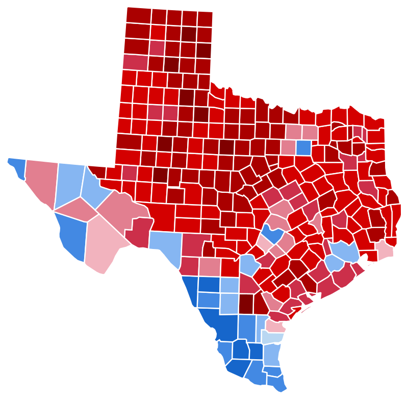
Texas counties: blue and red repartition
As a starter, here’s a map of election results in Texas, each portion being a county. See how many blue counties there are, even though Texas is a traditionally red state ? Also, note that big cities tend to be located in blue counties, whereas more rural areas represent red counties. For example, Dallas is the small blue square, isolated amoung red ones in the top right region !
Let’s look at how the hit rate and threshold repartition changes based on the county color.
Once again, we are looking at large numbers of police stops - no worries for the significancy of our results ! See it for yourself :
| Texas county group | Number of stops per year | Number of searches per year |
|---|---|---|
| Red counties | 2 827 560 | 23681 |
| Blue counties | 1 107 608 | 4153.9 |
Comparison of red and blue counties
Again, let’s have a first look at our data through the following visualization:
This plot shows normalized hit rates and threshold for both blue and red counties.
- Same pattern as at for state-level (almost all values below one, so lower than the equivalent for white drivers)
- Always lower values for hispanic drivers than for black drivers
- No big differences in hit rates between red and blue counties
- For thresholds, a small gap with lower values for red counties.
Following we have the equivalent of the previous plots, but at the Texas level, where the points take the color of the county:
Our observations
First, let’s specify that we have clearly too few points in blue states to allow a global visualization and obvious conclusion drawing from these plots. But still, we can make a few observations : About disparities :
- a disparity remains between black and hispanic drivers, with hispanic hit rates and thresholds further from the diagonal than black ones. This is seen in county groups and for all parameters.
- some relative hit rates and thresholds for black drivers are even above the diagonal, but almost none for hispanic drivers
About red and blue differences:
- Red counties tend to have very spread pointsand some are really far below the diagonal. In the blue states, we don’t see points that are that far away.
- Blue counties points are not numerous, but some represent a large number of police searches. Their repartition is globally close to the diagonal.
- All parameters seem to be higher in red counties, even for white drivers: the points are located in the middle of the diagonal, with no point close to the origin.
Statistics
Table with normalized and weighted mean:
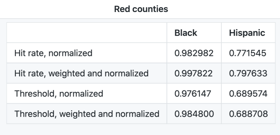
Here we have standardised the values by their equivalent for white drivers. Each value (hit rate or threshold) is a proportion of its equivalent (hit rate or threshold for white drivers). We have calculated the average of these values for each political party and race. The averages are obviously weighted by the number of searches in the county. We can see that all values are lower in red counties, except the hit rate of black drivers. However, the difference is not obvious. The difference between black and Hispanic drivers is striking, with a constant difference of up to 0.3 between black and Hispanic drivers, the values for Hispanic drivers being lower.
Mann-Whitney U test
Okay, juste like with the states’ comparison, let’s run the Mann-Whitney U test on the normalized values for each parameter and each race:
| p-value | |
| Mean Black hit rate | 0.64224 |
| Mean Hispanic hit rate | 0.14101 |
| Mean Black threshold | 0.00734 |
| Mean Hispanic threshold | 0.00641 |
Given these p values we can only reject the null hypothesis for mean black and thresholds, suggesting bias in these thresholds for blue states. The rest of p values are small but not low enough to reject the null hypotheses.
Investigation of other parameters
What if other parameters come into play ? Blue counties are also where cities are. Apart from their political orientation in which they usually differ from the countryside, other parameters are to be taken into account. For example, there are more police searches there. We checked if there was a link between the number of searches and the hit rate or threshold, thanks to the Spearman test that measures the dependency between two variables. We found none. This allows us to take away another variable.
Can we conclude anything ?
What we cannot say
Let’s not draw conclusions too quickly !
It is very important to remember that we are only observing certain characteristics. They have certainly been chosen because they allow a quantification of clear parameters that can be linked to, among other things, the race of the driver. However, it is important to remember that this is an observational study and not an experiment: we do not know all about the environment in which these arrests took place, nor the various parameters that could have affected them - even though we thought of some. We point out that disparities in these parameters seem correlated to the race of the driver, but we do not establish a causal link, due to the lack of a sufficiently rigorous and varied investigation (historical and political context, sociological study, comparison with other countries, comparison with other types of police intervention, etc.) to conclude in this way.
What we can say…
Clear conclusions on non-Caucasian drivers hit rates and thresholds
As stated in the Stanford University paper, we did observe lower hit rate and threshold values for non-Caucasian drivers, suggesting a bias in the decision of conducting of search by police officer for these drivers. In addition, the values for Hispanic drivers differed even more markedly from their equivalent for white drivers.
No clear conclusion on state major political party
Although the averages of the normalised parameters are lower in the red states than in the blue states (found thanks to the Mann-Whitney test), the global distributions are not obviously different between the two groups of states. Our data and therefore our results remain heterogeneous and have no clear trend according to the colour of the state. As the states include a large number of counties that are themselves very various in terms of police stops and political orientation, we cannot base our study on the state level. If there is a correlation, it is normal that it is not or hardly visible at this level. We have to look at the counties to find out more !
Overall conclusion
When you look at counties with more accurate data, you get more results! When comparing thresholds, we found that the red counties in Texas had significantly lower averages. In other words this suggests that the threshold for conducting a search is lower for black and Hispanic drivers in red counties than in blue counties
Furthermore, the model trained on our dataset gives significant weight to the political party of a county in predicting the hit rate and threshold.
These results may be caused by differences in ideology, policing requirements or even socio-economic indicators between the countryside and the city. They may not necessarily be impacted by one political party or another. In short, there are many other correlation factors which we may not have thought of, of course. Since we cannot immediately deduce causalities, we would encourage you to look at these correlations calmly and openly!
References
-
New York Times, 2016 Presidential Election Results, consulted in 2020
-
Stanford Computational Journalism Lab and the Stanford Computational Policy Lab, The Stanford Open Policing Project, 2020
-
Unsplash: photo for everyone, consulted in december 2020: